
Surface Normals
David Kanenwisher • September 24, 2022
swiftMy first attempt is confusing and clearly not correct.
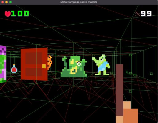
I isolate a few wall tiles to make it easier to see the problem:
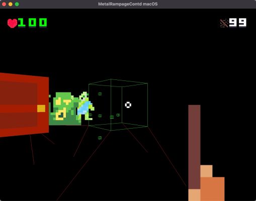
I get the normals to appear horizontal.
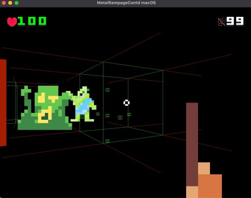
I add half the vertical normals.
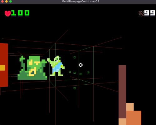
I’m passing the normals through to the shader but there may be something a little off.
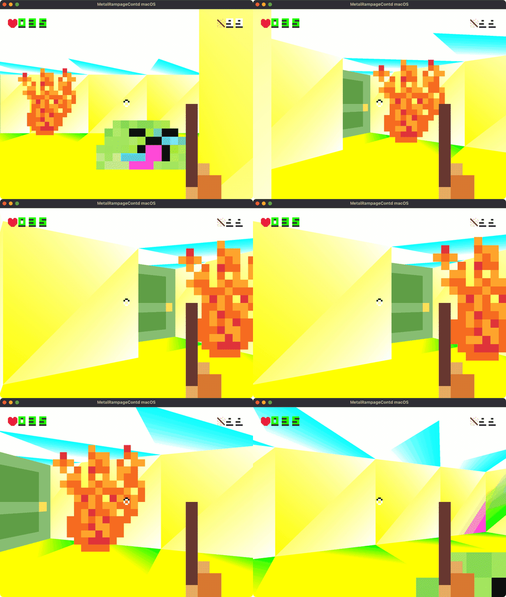
I think the trouble might be that I don’t have enough normals.
// .normal
$0.attributes[VertexAttribute.normal.rawValue].format = MTLVertexFormat.float3
$0.attributes[VertexAttribute.normal.rawValue].bufferIndex = VertexAttribute.normal.rawValue
$0.attributes[VertexAttribute.normal.rawValue].offset = 0
$0.layouts[VertexAttribute.normal.rawValue].stride = MemoryLayout<Float3>.stride
I think I still have something wrong with my understanding of normals. I think the normals are more like UV coordinates. They a property of the surface of the object. They are just a direction from the surface of the object.
All of the surfaces are flat so I may be able to just use float3(1.0, 1.0, 1.0) in the shader as the normal for all the vertices and return float4(normal.x, normal.y, normal.z, 1);. This is what I get:

I switch to the vertex’s normals float3(in.normal.x, in.normal.y, in.normal.z) I get:
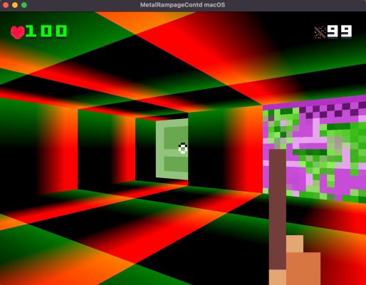
I think this is what I want because it gives the surface a top and bottom and a left a right for the lighting to shade. The red is the darkest on the right because where the value of x is the highest. The green is darkest on the top where the value of y is the highest. I’m not sure if that’s quite right but it seems better. The ceiling might be a bit of a problem...for a different day.
Lets see what this looks like with some lighting, starting with hemispheric lighting:
float4 sky = float4(0.34, 0.9, 1.0, 1.0);
float4 earth = float4(0.29, 0.58, 0.2, 1.0);

float intensity = in.normal.y * 0.5 + 0.5;
return mix(mix(sky, earth, intensity), float4(colorSample), in.normal.y * 0.5 + 0.5);
The idea here being that the top is a bluish color and bottom is a greenish color[1].
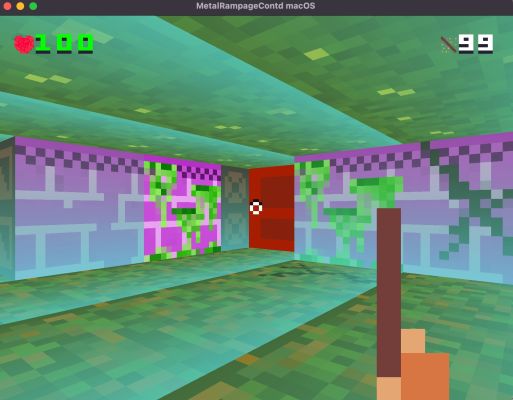
Then just for fun with the world transform:
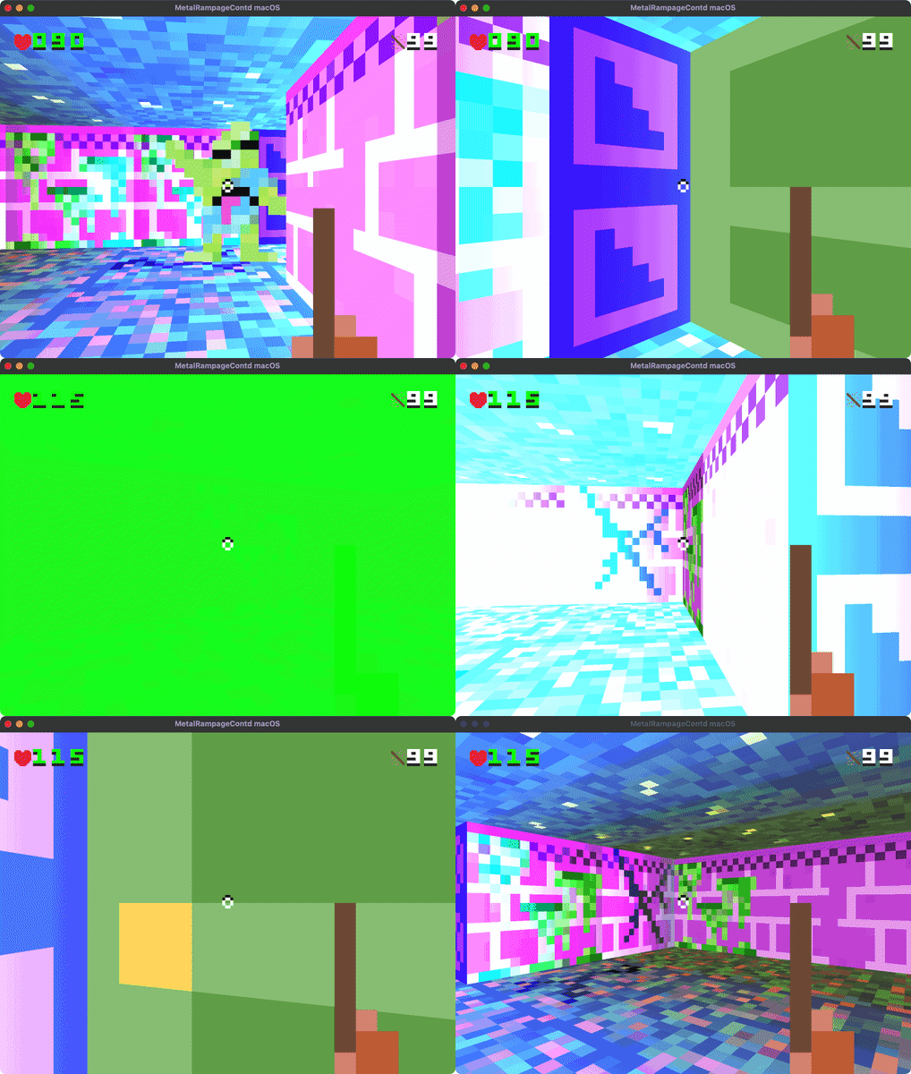
I love the colors from this. Eventually I’ll have to figure out how to intentionally get something similar.
[1] Thanks for the lighting tutorials Metal By Tutorials! By Caroline Begbie & Marius Horga
